URBAN NATIVE ERA
(Case Study)
For this case study, I completely repositioned Urban Native Era as a mid-level luxury brand. I utilized strong type, solid copy, and the sourcing of beautiful editorial images to elevate the brand and give them a new look and feel. This site was selected and featured by iLoveCreatives on their “Internet Gems” page.
S&S Prod. & Entertainment
A wedding events company that we transformed, giving them a more appropriate identity that includes simple yet sleek typography, a color scheme that harkens to the client’s South Indian roots and big, beautiful media.
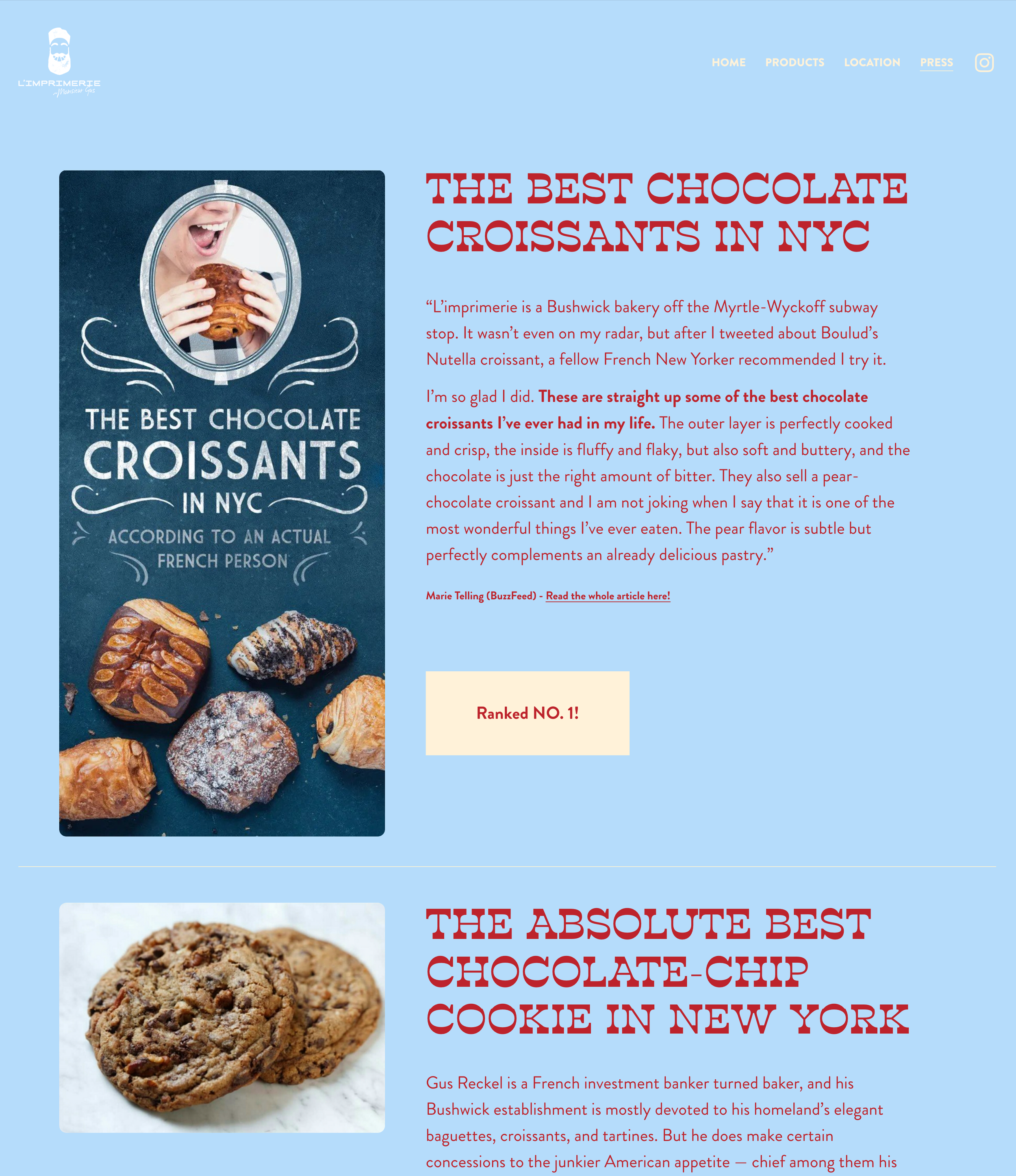
L’IMPRIMERIE
(Case Study)
A case study for a French bakery in Bushwick, Brooklyn using punchy & super fun typography. All paired with big, bold, yummy images of the delicious goodies this place has to offer.
Glitzy cleaning
(Live Site)
Glitzy needed a website to match their already cute and bubbly name. The layout is streamlined and simple, paired with a quirky color scheme to bode with Glitzy’s unique brand identity.


